Mancine
Herzberg Design · 2024
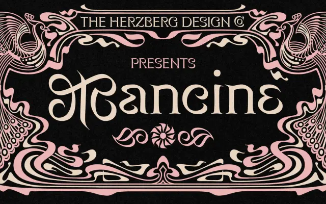
A display typeface built on a 150-degree pen angle, the natural grip of a left-handed calligrapher, filtered through Art Nouveau letterforms.
About
Where most Latin typefaces trace their contrast to a broad-nib pen held at 30 degrees, Mancine inverts that logic entirely, using a 150-degree angle that produces a wholly different stress pattern. The result is swashy, bohemian uppercase forms paired with an OpenType 'trailing caps' feature that automatically replaces subsequent capitals with simplified versions, preventing visual overload in running text. Seven styles are available with variable font support, and the character set extends to ligatures, oldstyle figures, localised forms and a full suite of alternates.
Classification
Described explicitly as a display typeface with an Art Nouveau aesthetic; its unusual reverse-contrast structure derived from left-handed calligraphy at 150 degrees places it firmly outside conventional serif or sans-serif categories.