Hurme FIN 2a
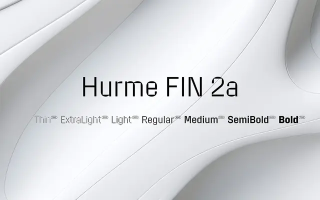
A geometric sans with sharp rectangular counters set against round outer shapes, with the three lightest weights drawn as stencils.
About
Based on the normal width of Hurme FIN 1, the design pairs rectangular interior counters with rounded outer letterforms to produce a distinctly technical, engineered aesthetic. The Thin, ExtraLight and Light styles are stencil cuts, adding a further industrial quality to the lighter end of the range. Short ascenders and descenders and horizontal stroke terminals keep it compact and structured across seven weights from Thin to Bold.
Classification
The typeface features sharp rectangular counters contrasting with rounded outer shapes, giving it a highly engineered, geometric character. Its horizontal stroke terminals and stencil variants in lighter weights reinforce its geometric, technical classification.