Hurme Oval Sans High Contrast
sans-serifgeometric sanscondensed
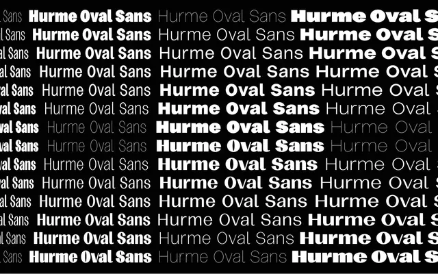
A high-contrast geometric sans from Hurme Design built across four widths and seven weights, with oval letterforms that push the family toward display use.
About
The family runs from Condensed to Wide, with Thin through Black in each width, giving 28 static styles in total. Stroke contrast is consistently high across the range, lending lighter weights an almost flared quality and heavier weights a sharp, poster-ready presence. The oval construction keeps it feeling warmer than a strict modernist high-contrast sans.
Classification
A geometric sans with high stroke contrast and oval forms, spanning four widths and seven weights. The oval-based construction and strong contrast axis give it a display-oriented character distinct from neutral grotesques.
Weights
ThinLightRegularMediumSemiBoldBoldBlack
Optical sizes and widths
CondensedNarrowNormalWide
Languages
Latin
Tags
geometrichigh-contrastdisplaycondensedwidevariableoval