Hurme Oval Sans Low Contrast
sans-serifgeometric sanscondensed
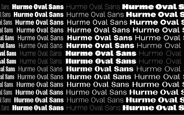
A geometric sans built on oval forms with near-zero stroke contrast, available across four widths and seven weights.
About
Oval construction and flattened stroke contrast give this family a clean, even colour on the page across all settings. Four width variants — Condensed, Narrow, Normal and Wide — each carry seven weights from Thin to Black, yielding a large matrix suited to editorial systems and brand work requiring flexibility. The absence of italic cuts keeps the palette focused on weight and width rather than posture.
Classification
Oval-construction geometric sans with deliberately suppressed stroke contrast; the name and letterform samples confirm a geometric skeleton with even, low-contrast strokes throughout.
Weights
ThinLightRegularMediumSemiBoldBoldBlack
Optical sizes and widths
CondensedNarrowNormalWide
Family
Hurme Oval Sans Low Contrast CondensedHurme Oval Sans Low Contrast NarrowHurme Oval Sans Low Contrast NormalHurme Oval Sans Low Contrast Wide
Languages
Latin Extended
Tags
geometriclow-contrastvariablemulti-widthcondensedneutralcontemporary