Niveau Serif
HvD Fonts · Hannes von Döhren · 2013
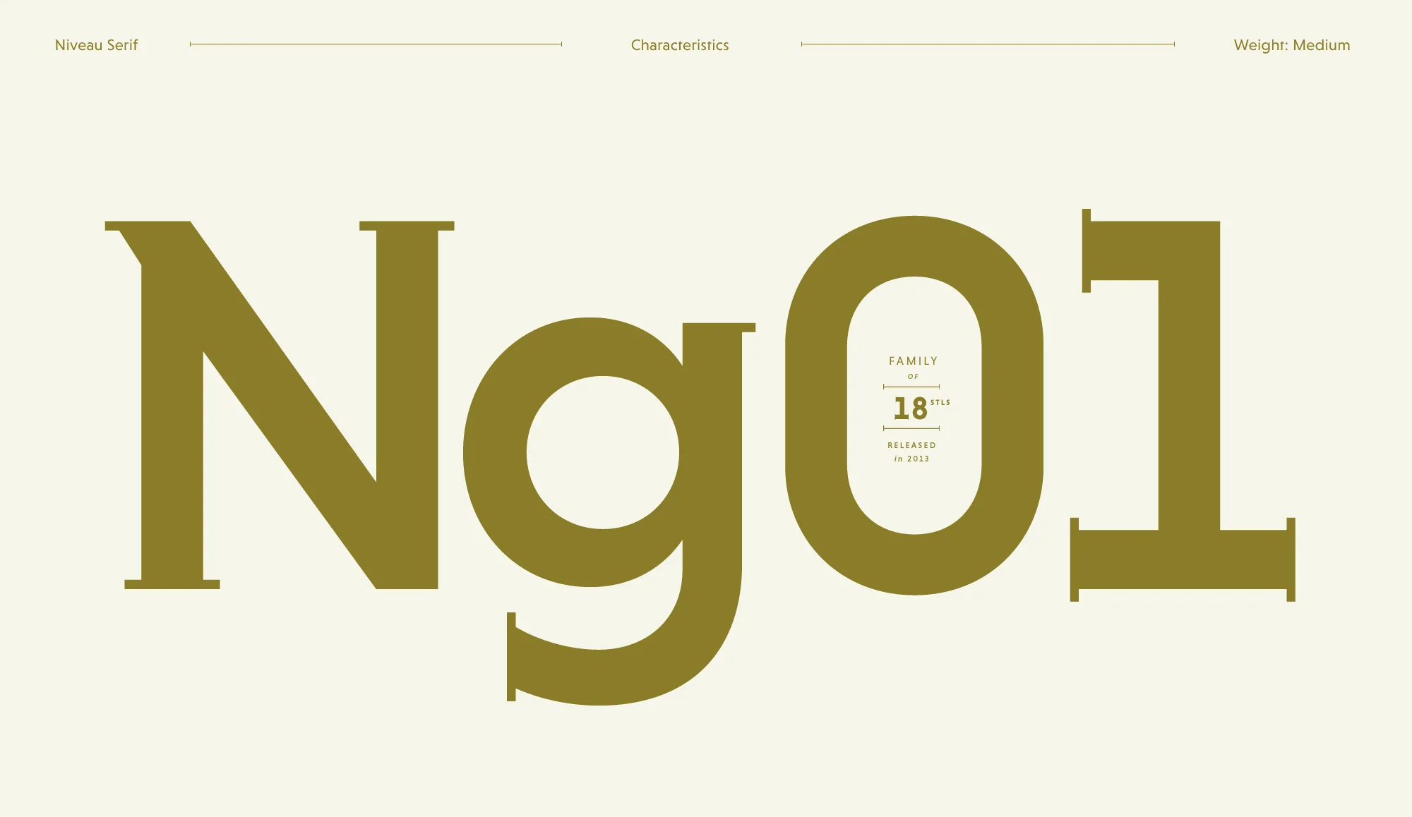
A humanist serif by Hannes von Döhren designed as a companion to Niveau Grotesk, sharing its warm proportions and structured rhythm.
About
Designed by Hannes von Döhren at HvD Fonts, Niveau Serif pairs directly with Niveau Grotesk through shared optical sizing, proportions and overall texture. Low-contrast serifs and open apertures give it readability at text sizes while retaining enough character for display use. A practical choice for editorial and corporate projects that need a serif and sans-serif from the same visual family.
Classification
Niveau Serif is a humanist serif designed to complement Niveau Grotesk, sharing its warm proportions and optical balance. Its serifs are low-contrast with a contemporary feel, placing it in the humanist serif category.