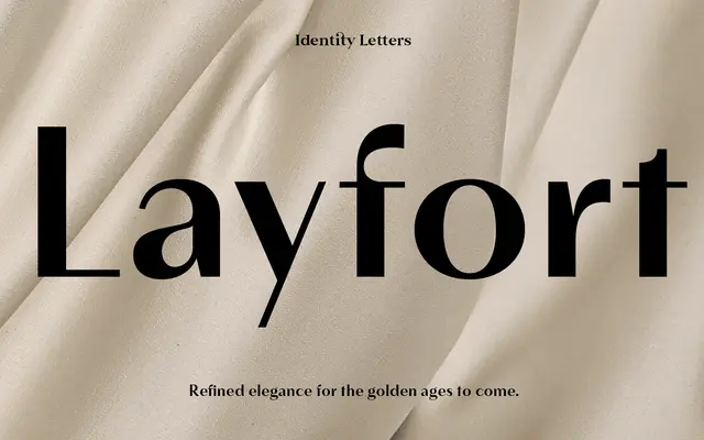
A contrasted sans-serif drawing on Art Déco and industrial grotesque traditions, with old-style letter-width variation and true italics narrower than their upright counterparts.
About
Layfort pairs the directness of an industrial grotesque with the swagger of Art Déco styling, producing a contrasted sans that sits between fashion editorial and serious corporate work. The varying letter widths give text a livelier texture than a typical contemporary sans, and the true italics are genuinely narrower rather than simply slanted. Thirty-two fonts span eight weights with matching italics across two subfamilies, the Plain variant offering an alternative detail set, and 750 glyphs cover extended Latin with oldstyle figures, discretionary ligatures and circled or squared ornamental sets.
Classification
Described as a contrasted sans-serif with old-style proportions and vivid width variation, drawing on both industrial grotesque and Art Déco influences, placing it between a classical grotesque and a stylised display sans.