Pata Slab
In-House Intl · Alexander Wright, Rodrigo Fuenzalida · 2020
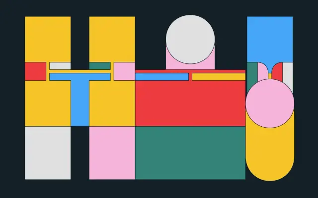
An ultra-heavy display slab with hairline contrast centres, no descenders and a fixed-width modular grid that makes every character the same height and width.
About
Designed by Alexander Wright and Rodrigo Fuenzalida at In-House Intl in 2020, Pata Slab takes its name from a colloquialism for feet and builds upward from a chunky baseline with no descenders whatsoever. All uppercase characters sit within a square of identical width and height, while lowercase letters, numerals and punctuation follow the same height restrictions, creating a highly uniform modular system. The standard-height terminals allow for near-endless ligature combinations, making it well suited to stacked display headlines and poster layouts.
Classification
An ultra-heavy display slab serif with extreme weight contrast between thick stems and hairline centres, modular construction and no descenders, placing it firmly in the display slab category.