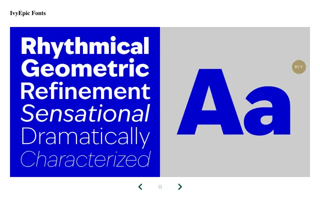
A geometric grotesque drawing on 1920s precedents, distinguished by tapered tails and terminals that open up counters and lend warmth across 36 styles and a variable version.
About
Built on the formal overlap between geometric sans and early grotesque, IvyEpic carries more contrast than most contemporary sans-serifs. Its tapered tails and terminals keep counters open at heavier weights, producing a friendlier texture suited to both body text and display setting. The superfamily spans 36 styles across standard and condensed widths, with italics throughout and a variable font covering weight and width axes.
Classification
IvyEpic is described as a fusion of geometric sans and grotesque traditions from the 1920s, with higher-than-usual contrast and tapered terminals that soften the geometry — placing it squarely at the intersection of geometric and grotesque sans-serif.