Blackbird Roman
JP Flexner · JP Flexner
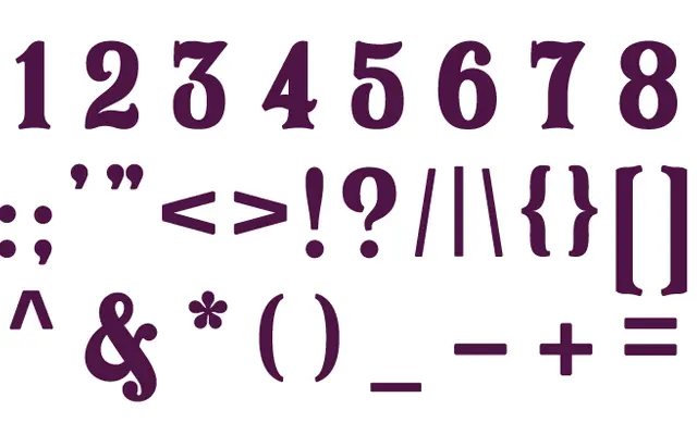
A display serif created for the Blackbird brand identity, featuring an alternate character set of ligatures and flourishes that soften its otherwise formal tone.
About
Designed as the centrepiece of the Blackbird logo, this display serif works alongside a companion script. The alternate character set introduces ligatures and decorative flourishes that counterbalance the typeface's more mature, structured qualities, lending it a playful quality when alternates are mixed with the standard alphabet. Primarily suited to logotype and branding contexts where a formal serif needs a degree of warmth.
Classification
A display serif with alternate characters and ligatures designed for logotype use, with decorative flourishes that soften an otherwise formal structure.