Elfreth
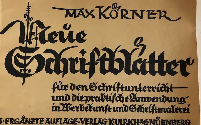
A lower-contrast blackletter in four weights that softens the style's traditional severity without tipping into pastiche.
About
Elfreth reduces the thick-thin contrast typical of blackletter to give the letterforms a more casual, bone-like quality, while subtle curves replace rigid angles throughout. Letterforms that commonly trip up non-German readers, such as the k and x, are redrawn to blend traditional German forms with more familiar constructions. The result holds together across the full weight range from Light to Black, with oldstyle figures and contextual alternates rounding out the OpenType feature set.
Classification
Elfreth is a blackletter typeface that deliberately departs from traditional textualis and fraktur conventions by reducing contrast and softening angles, giving it a more casual, contemporary character while retaining blackletter structure.