Gastromond
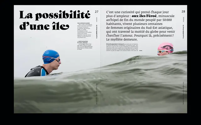
A fat face serif that fuses Garamond's angled Renaissance stress with the extreme weight contrast of Victorian display types, loaded with swashes and alternates.
About
Where most fat faces inherit vertical or horizontal stress from Didot or Bodoni, Gastromond applies the angled pen stress of Garamond-tradition letterforms to an ultra-heavy display weight. The italic is particularly rich, offering swashed capitals, alternate diagonal letters drawn to match the italic angle, and lowercase swashes carried over from both upright and italic Garamond conventions. Small caps, discretionary ligatures, tabular figures and multiple stylistic sets round out an OpenType feature set suited to editorial and branding work that wants period character without period constraints.
Classification
Gastromond is a display fat face that deliberately fuses Renaissance Garamond proportions and angled stress with the extreme weight contrast of Victorian fat faces, placing it firmly in the display serif tradition.