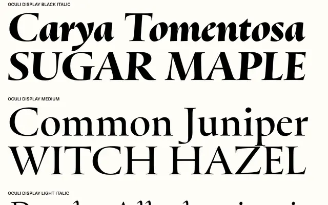
A typeface that reimagines Roman inscriptional lettering with a designed lowercase, split across Display and Text optical sizes with Renaissance-derived italics at a 4-degree slant.
About
Oculi takes Roman carved capitals as its starting point, then pursues the hypothetical question of what a matching lowercase would look like if built for running text. The oldstyle contrast of the capitals carries through to the lowercase, and the italics borrow their forms from Arrighi and Griffo rather than simply slanting the upright letters. Two optical sizes divide the family: Display holds higher contrast with gently curving strokes, while Text opens counters, loosens spacing and raises the x-height for legibility at smaller settings.
Classification
Oculi draws directly from Roman inscriptional lettering for its capitals, with an oldstyle contrast model governing both Display and Text optical sizes. The italics derive from Renaissance models by Arrighi and Griffo, placing the family firmly in the humanist serif tradition.