JT Picolo
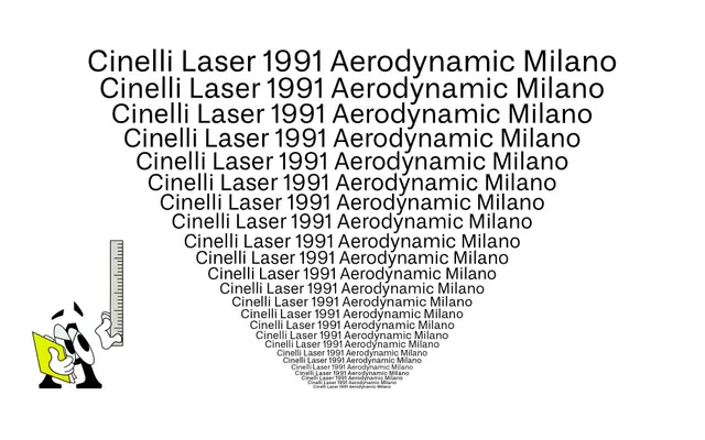
A variable grotesque drawn from 19th-century high-contrast sources, particularly the 1875 Breede Grotesque, with Cyrillic support and OpenType alternates preserving historical double-storey letterforms.
About
Rooted in research into 19th-century high-contrast grotesques, the design draws directly from the Breede Grotesque issued by Van der Wiel & Hooijer in 1875 and its later Tetterode iteration. Historical references such as double-storey /g and /r are retained as OpenType alternates rather than defaults, allowing users to shift between a cleaner contemporary register and a more characterful, period-inflected one. The variable axis spans Regular through Bold with matching italics, and Cyrillic support extends its usefulness across a broader range of markets.
Classification
Explicitly rooted in 19th-century high-contrast grotesque sources, specifically the Breede Grotesque and its Tetterode iteration, placing it firmly in the grotesque sans-serif tradition with historical display-weight references.