JAF Cupidus
Just Another Foundry · Tim Ahrens and Shoko Mugikura · 2022
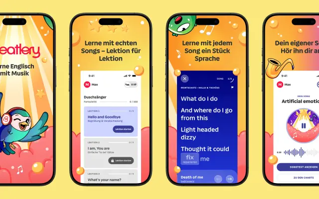
A rounded sans by Tim Ahrens and Shoko Mugikura built around an extremely high x-height that compresses the visual hierarchy between upper and lowercase letters.
About
Designed by Tim Ahrens and Shoko Mugikura and published in 2022, Cupidus extends JAF Domus's principle of equalising counter spaces into the vertical axis, producing an unusually compact cap-to-x relationship. Ten weights with matching italics span Ultralight to Ultrabold, while the accompanying Cupidus Text subfamily adjusts letter spacing, word spacing and x-height for sustained reading at tight line spacing. The family won a TDC 2023 award and has been used in brand identity work for cooking apps and similar digital-first contexts.
Classification
A rounded sans-serif with an extremely high x-height and equalised counter spaces, designed to reduce the hierarchy between upper and lowercase letters. The Text subfamily adjusts spacing and x-height for continuous reading.