JAF Facit
Just Another Foundry · Tim Ahrens · 2005
sans-serifhumanist sansitalic
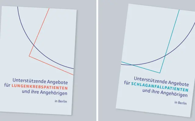
A humanist sans by Tim Ahrens spanning six weights with italics, designed for print and later adapted for screen use.
About
Designed by Tim Ahrens and published in 2005, JAF Facit runs from Extralight to Extrabold with matching italics across all six weights. The weight range allows typographic voices from delicate and approachable to firm and assertive while maintaining stylistic consistency throughout the family. A screen-optimised version, Facit Web, has gained traction for online use alongside the original print-focused release.
Classification
JAF Facit is a humanist sans-serif, balancing warmth and precision across its weight range, originally conceived for print with a screen-optimised web variant developed later.
Weights
ExtralightLightRegularSemiboldBoldExtrabold
Languages
Latin
Tags
humanistsans-serifprintwebelegantversatilescreen-optimised