JAF Globus
Just Another Foundry · Tim Ahrens and Shoko Mugikura · 2026
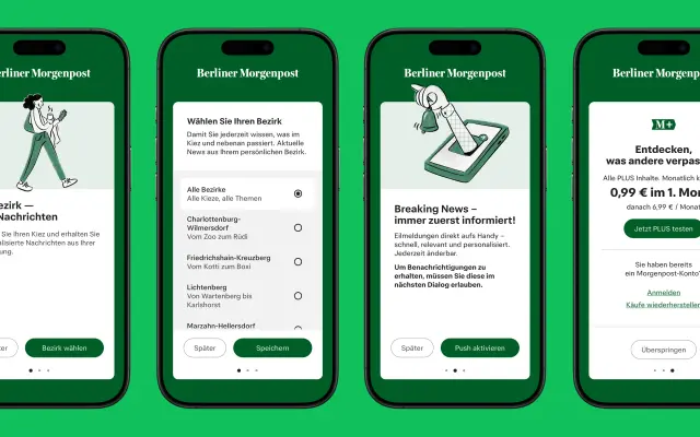
A screen-optimised geometric sans by Tim Ahrens and Shoko Mugikura, designed for news app use with six weights and matching italics.
About
Built with small-screen legibility in mind, JAF Globus draws on Univers and JAF Bernini Sans while maintaining a geometric character through careful stroke transitions and open counters rather than strict geometric construction. Letter widths are adjusted at key points, such as a wider t and f, to keep longer text comfortable in body settings. Six weights from Light to Ultrabold with italics give it range across display and editorial work, as demonstrated in its deployment as a custom font for Berliner Morgenpost via Funke Mediengruppe.
Classification
Described by the foundry as modernist with a geometric feel, drawing on Univers and JAF Bernini Sans; circular rounds and generous spacing give it a geometric quality without strict geometric construction.