JAF Lapture
Just Another Foundry · Tim Ahrens, Oleg Macujev · 2004
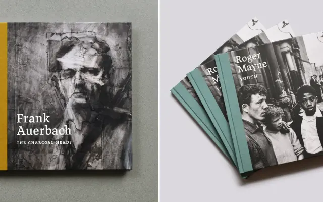
A careful revival of Albert Kapr's Leipziger Antiqua, distinguished by its unusual hybrid of blackletter rhythm and roman structure across two optical sizes and a condensed sub-family.
About
Originally digitised in 2004 by Tim Ahrens from Kapr's 1971 Typoart design, the family was substantially expanded in 2025 with extra-heavy weights, condensed styles and Cyrillic support added by Oleg Macujev. The Text cut is optimised for smaller sizes, while the Display subfamily runs to ten styles from Regular to Black, each with matching italics. Its blend of calligraphic energy with classical roman proportions makes it well-suited to cultural publishing, exhibition catalogues and editorial contexts where a straightforward serif would feel inert.
Classification
Rooted in Albert Kapr's Leipziger Antiqua (1971), which blends blackletter and roman traditions; the result is a humanist serif with distinctive calligraphic tension rather than a purely classical or transitional structure.