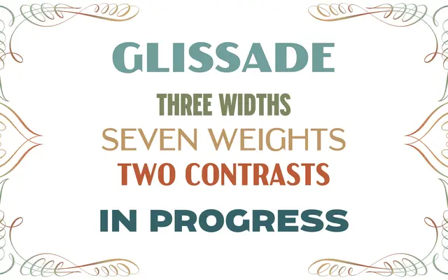
A WPA National Parks poster-inspired display family with contrast and monoline variants across standard, condensed and compressed widths.
About
Taking its cues from the lettering of WPA National Parks posters, Glissade offers a high-contrast display cut alongside a low-contrast Monoline version across seven weights from Light to Black. The family spans three widths — standard, Condensed and Compressed — with variable fonts available throughout, giving designers considerable flexibility for poster and branding work. Swashy R and Q tail alternates add period-appropriate character to the set.
Classification
Glissade draws directly from the lettering tradition of WPA National Parks posters, which sit squarely in the Art Deco display vernacular. The low-contrast variant (Monoline) distinguishes it further, but the primary design intent is decorative and display-oriented.