Esperanza
Labor and Wait · 2022
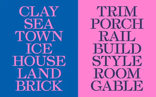
A transitional serif designed in 2022 for the Athens Cultural Center, drawn from lettering stamped into 19th-century stoneware at the Athens Pottery Works in the Hudson Valley.
About
The roman echoes the late transitional types of William Martin and Richard Austin, the predominant models of the colonial period, while a caps-only stencil cut was designed for genuine practical stencilling rather than mere decoration. A full lowercase followed, and an unusual upright variant applies the tail terminal of the roman 'a' to the 'u', producing a non-italic that performs italic functions, drawing on Aldus Manutius and W.A. Dwiggins as precedents. The family comes in three sub-families: Esperanza, Esperanza Headline and Esperanza Stencil.
Classification
Inspired by late transitional English types of William Martin and Richard Austin, Esperanza echoes the sturdy, upright character of 18th-century British printing types with a distinctive upright lowercase variant alongside roman and stencil cuts.