OBBLIGATO
Labor and Wait · Manuel Miranda · 2008
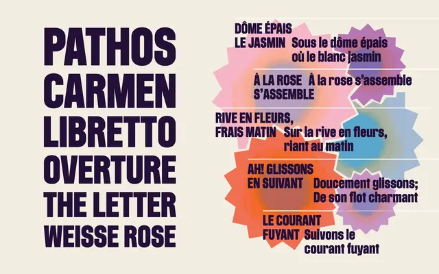
A heavy all-capitals titling face rooted in Teutonic 19th-century letterforms, originally commissioned for New York City Opera's identity by 2x4 in 2008.
About
Based on 'Mortier', designed by Manuel Miranda at 2x4 for New York City Opera and named after the company's then-incoming director Gerard Mortier, the typeface draws on the solid, straight-sided titling fonts of late 19th-century Germanic typographic tradition. Its caps-only structure makes it suited to opera programmes, cultural institution identities and editorial display work where typographic authority is required. OpenType features include tabular figures, alternates for a, g, y, u and w, and case-sensitive forms.
Classification
A caps-only all-capitals titling face drawn from solid, heavy, straight-sided Teutonic titling conventions of the late 19th century, designed expressly for large-scale display use in opera and cultural contexts.