Iskry
Laïc · Maciej Połczyński · 2024
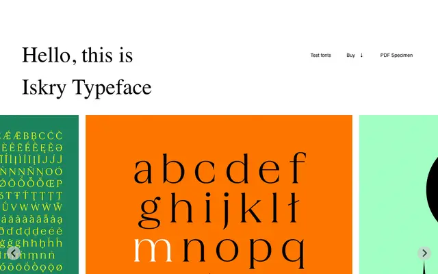
A high-contrast serif with sharp, pointed terminals designed by Maciej Połczyński, its name taken from the Polish word for sparks.
About
Designed by Maciej Połczyński and released in late 2024, Iskry draws attention through its pronounced and uneven stroke contrast and aggressively pointed terminals that give the letterforms a biting, energetic quality. The proportions between uppercase and lowercase are deliberately distinct, adding to the typeface's idiosyncratic personality. With 300 glyphs and full Polish Latin coverage, including oldstyle figures and a stylistic set, it is suited to expressive editorial and display work.
Classification
Iskry is classified as a serif with large and uneven contrast, featuring sharp pointed terminals that give it an expressive, display-oriented character distinct from conventional text serifs.