Pion
Laïc · Maciej Połczyński · 2021
sans-serifgrotesquecondensed
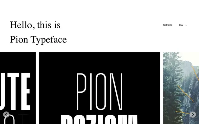
A narrow, upright display sans by Maciej Połczyński, built for headline use with strong Polish character support.
About
Designed by Maciej Połczyński and released in 2021, Pion takes its name from the Polish word for 'upright' or vertical, a reference to its narrow, tall proportions. The family ships in eight styles and covers the Latin script with full Polish diacritic support. Its condensed geometry makes it well suited to editorial headlines and display settings where vertical rhythm is a priority.
Classification
Pion is described as a narrow sans serif, placing it within the grotesque tradition. Its headline-focused, condensed proportions and upright geometry suggest a display grotesque.
Weights
RegularBold
Languages
Latin
Tags
narrowheadlinegrotesquedisplaycondensedpolishuppercase