Arlette
Letterjuice · 2016
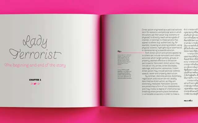
An experimental sans-serif drawing on Roger Excoffon's Choc for its stroke energy, extended with rich swash sets and full Thai coverage across eight weights.
About
Built as a deliberate reaction against Helvetica-like homogeneity, Arlette takes its formal cues from the fast, energetic curves of Excoffon's Choc and applies them across a Latin family of eight weights with italics, all featuring an unusually extensive set of swashes extended to accented and special glyphs. The Thai script was developed with Fiona Ross as consultant, adapting the same expressive stroke movement and adding alternate characters drawn from handwritten palm-leaf forms. Awards from Print mag, Hii Type and Granshan's Thai category reflect a genuinely ambitious multilingual undertaking.
Classification
A sans-serif that deliberately departs from neutrality, drawing on Roger Excoffon's Choc for its fast stroke energy and expressive curves, placing it firmly in the expressive or experimental sans-serif territory rather than any neutral grotesque lineage.