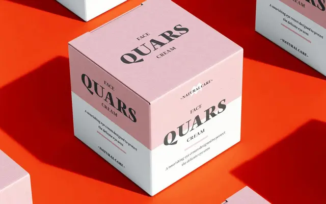
A text and display serif drawing on Scotch Roman contrast and Dutch sharpness, designed primarily for magazine and editorial use.
About
Quars offers five styles spanning regular, italic, bold, black and a dedicated display cut, covering both running text and titling needs. Its italic is set at just 1 degree of slant, a deliberate choice that preserves uppercase letterforms from the distortion common in more steeply inclined italics. The glyph set includes discretionary ligatures crafted for titling, along with ornaments derived from anonymous metal types found in an old printing workshop near Barcelona.
Classification
Quars draws from Scotch Roman contrast and the sharpness of contemporary Dutch designers, placing it firmly in the transitional serif tradition with a contemporary editorial edge.