Filac 30
Lettermin · 2024
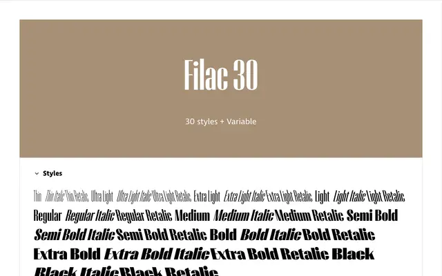
A high-contrast display sans grown from ultra-compressed film poster lettering, with vertical stems that expand dramatically across ten weights while horizontals stay uniformly thin.
About
Beginning as Flac, a study in ultra-compressed type from old movie posters, the design eventually found a second logic: rather than expanding letterforms outward in all directions, weight is added exclusively along the vertical axis. The result is a ten-weight family with a striking stroke contrast that intensifies as the weights increase. The '30' in the name signals a planned typographic system of widths, with wider siblings at 45, 60, 90 and beyond yet to come. Stylistic references run from midcentury cool jazz to Blue Note Records sleeve design by Reid Miles.
Classification
Filac 30 is a display sans built around extreme vertical-to-horizontal stroke contrast, where weights grow outward along the vertical stems while horizontal parts remain thin throughout. Its origins in ultra-compressed film poster type and midcentury jazz record sleeve design place it firmly in the display category.