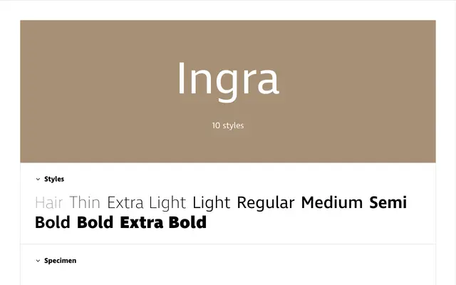
A near-monolinear humanist sans built around editorial practicality, offered in ten weights and three genuine widths with an extensive OpenType feature set.
About
Designed with editorial density in mind, Ingra keeps stroke contrast minimal and counters open, yielding a text colour denser than typical humanist sans-serifs — useful in narrow columns and tight leading. Three authentic widths, from Condensed to Wide, provide a genuine hierarchical palette rather than mechanically squeezed variants. The OpenType suite covers small caps, four numeral styles, superior and inferior figures, arbitrary fractions, ordinals, pictograms and 16 stylistic sets, making it a capable toolkit for complex information design.
Classification
Ingra is described explicitly as a humanist sans-serif with near-monolinear strokes, open counters, and horizontally/vertically aligned terminals — hallmarks of the humanist sans tradition, engineered toward text legibility.