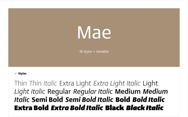
A nine-weight humanist sans from Lettermin built around near-invisible readability, with true italics, variable font files and over a thousand glyphs.
About
Mae is designed around the principle that a typeface serves best when readers stop noticing it. Its wide counters, open apertures and softly tapered shoulders produce reliable legibility from small print on low-grade paper through to screen interfaces and ebooks. Nine weights run from Thin to Black, each paired with a true italic, and stylistic sets offer alternate forms for commonly confused characters including a slab-serif capital I, semi-serif lowercase i and l, and a rounded y.
Classification
Mae combines a generous x-height, open apertures and softly tapered curved strokes with humanistic qualities, placing it clearly in the humanist sans tradition despite its rational, text-optimised construction.