LTR BeoSans
LettError · Just van Rossum · 1990
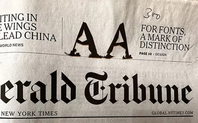
A sans serif companion to LTR Beowolf in which each glyph cycles through six pre-computed randomised iterations, available in Hard (angular) and Soft (curvaceous) variants across three degrees of jaggedness.
About
Drawn by Just van Rossum in 1990, LTR BeoSans applies the randomisation logic pioneered by Beowolf to a sans serif skeleton. Two structural variants define its character: BeoSans Hard uses straight lines and angles throughout, while BeoSans Soft eschews straight lines entirely. Each glyph has six distinct pre-computed outlines and three degrees of jaggedness per style, yielding twenty fonts in total across Plain and Bold weights. The family sits in the permanent MoMA design collection alongside Beowolf, and its cultural footprint spans Emigré, Frieze and the International Herald Tribune.
Classification
A sans serif whose outlines are deliberately randomised via pre-computed variations, making it a conceptual display typeface rather than a conventional grotesque or geometric sans. Its primary identity is defined by controlled randomness and experimental form rather than any conventional sans-serif subcategory.