Tartuffo
Lift Type · Bouk Ra · 2021
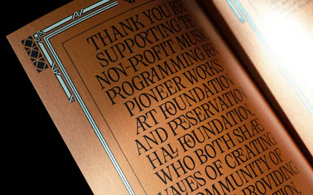
A contemporary serif by Bouk Ra with a deliberately contradictory character, named after Molière's hypocrite Tartuffe and the Italian tartufo di Pizzo dessert.
About
Designed by Bouk Ra and released in 2021, the family runs across five weights from Thin to Bold with matching italics, covering 824 glyphs and broad Latin Extended language support. Its fluid details and alternates give it range from refined body text to expressive display settings. Multiple stylistic sets, old-style figures, circled numbers and arrows make it a well-featured tool for editorial and branding work.
Classification
Tartuffo is described as elegant yet malicious, with fluid details and a distinctive personality; it reads as a contemporary serif with display sensibilities rather than a strict historical revival.