Marat
seriftransitional serifitalic
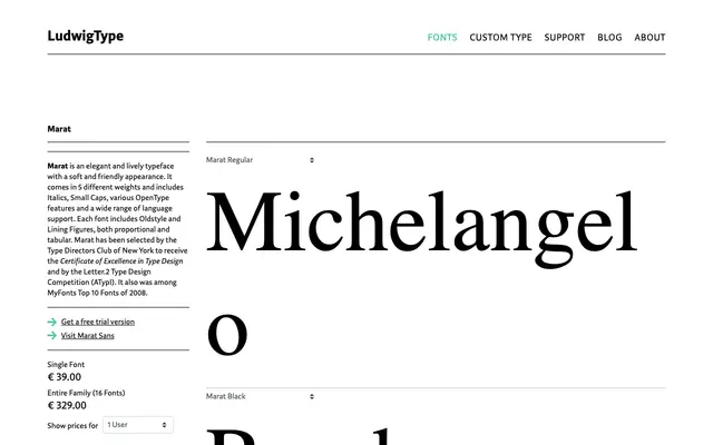
A transitional serif family from Ludwig with five weights, matching italics and small caps across each, plus a standalone Fat cut for display use.
About
Marat covers Light through Black with a corresponding italic and small caps variant for each weight, giving it a well-structured range for book, magazine and long-form editorial work. The Fat weight sits outside the regular sequence, offering a heavier display option. Small caps are built into the main family rather than treated as an afterthought, which reflects a considered approach to typographic hierarchy.
Classification
Marat presents the characteristics of a transitional serif with moderate contrast, structured letterforms, and small caps across its range, suited to extended editorial and book typography.
Weights
LightRegularMediumBoldBlackFat
Languages
Latin
Tags
transitionalserifeditorialbooksmall-capstextliterary