sans-serifhumanist sansitalic
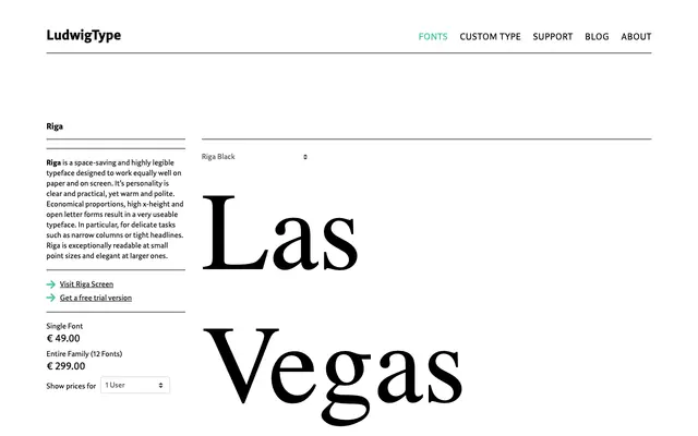
A six-weight humanist sans from Ludwig with matching italics across all cuts, suited to editorial and extended text settings.
About
Six weights from Extralight to Black, each paired with an italic, give Riga a wide tonal range within a humanist sans framework. The specimen suggests open, readable letterforms that hold up across both display and continuous text use. A clean, professional family without strong distinguishing features beyond reliable construction.
Classification
The letterforms visible across the specimen — particularly the open apertures, calligraphic stress and flowing italic cuts — point clearly to a humanist sans tradition rather than geometric or grotesque.
Weights
ExtralightLightRegularMediumBoldBlack
Languages
Latin
Tags
humanistsans-serifeditorialtextversatilecontemporary