Riga Screen
serifscreen serifitalic
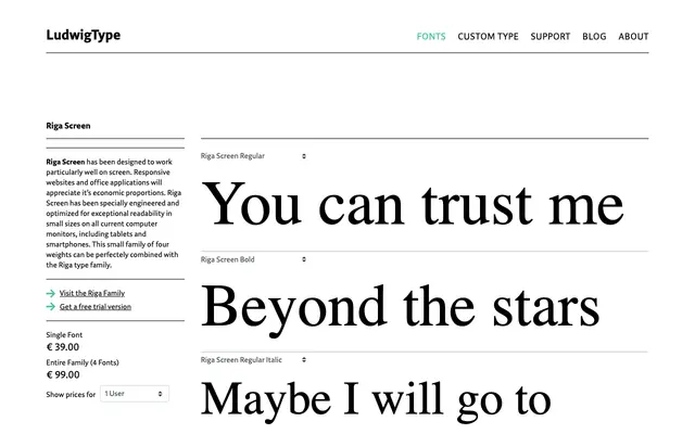
A screen-optimised serif from Ludwig, offered in two weights with matching italics for sustained reading on digital interfaces.
About
A serif family in four styles, pairing Regular and Bold with corresponding italics. The screen-focused design suggests attention to legibility at smaller sizes on digital displays. The family is compact and pragmatic, suited to body text in apps, editorial sites or digital publications.
Classification
The name and the four-style family structure suggest a serif designed specifically for screen readability, with Regular and Bold weights each paired with italics, pointing to a contemporary text serif optimised for digital environments.
Weights
RegularBold
Languages
Latin
Tags
serifscreentextdigitalreadablecontemporary