sans-serifgeometric sans
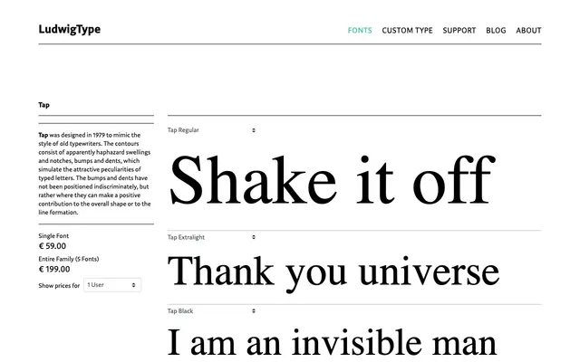
A five-weight geometric sans from Ludwig, spanning Extralight to Black with a clean, even construction suited to editorial and body text use.
About
Tap offers five weights from Extralight to Black, covering a range broad enough for both display headlines and running text. The even stroke construction and neutral character suggest a geometric lineage without eccentric detailing. It works comfortably across editorial layouts and interface settings where clarity is the primary requirement.
Classification
The specimen and weight range suggest a clean, geometric sans-serif with even stroke contrast and a neutral construction typical of the geometric genre.
Weights
ExtralightLightRegularBoldBlack
Languages
Latin
Tags
geometricneutralcleansans-seriftexteditorial