Escalles
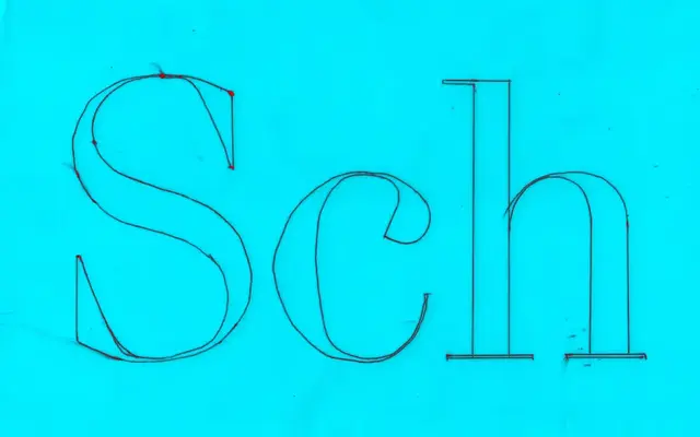
A high-contrast neoclassical serif with Didot and Walbaum influences, offered in three optical sizes for titles, leads and extended text.
About
Built on strong verticals, thin flat serifs and high stroke contrast, Escalles takes its letterforms from Firmin Didot and its proportions from Walbaum, then tempers the coldness typical of that lineage with rounded terminals and slightly stressed counters. Three optical subfamilies — Poster, Display and Text — each tune contrast and detail for their intended setting, from large display work down to body copy. The family ships in six weights with matching italics, and both upright and italic are available as variable fonts spanning Light to Black.
Classification
Luzi Type describes Escalles as a contemporary neoclassical serif with high contrast, vertical stress and thin flat serifs, drawing directly from Firmin Didot and Walbaum — hallmarks of the Didone subcategory, here called neoclassical.