Koper
Luzi Type · Diano Kitanovski
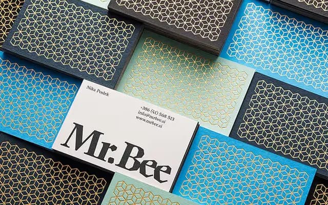
A serif drawn from Art Nouveau calligraphy and woodcut textures, referencing the work of Czech artist Vojtěch Preissig across four weights with a variable Regular–Display axis.
About
Built on linear strokes that echo both calligraphic hand and the rough grain of woodcut printing, Koper sits comfortably at text sizes while its particular elegance becomes legible at display scale. The family ships as static OTFs in Regular, SemiBold, Bold and Display, plus two variable fonts covering the upright and italic with a weight-and-optical-size axis. Latin Extended-A coverage supports a wide range of European languages.
Classification
Koper draws on the calligraphic and woodcut-inflected letterforms of Czech Art Nouveau, particularly Vojtěch Preissig, with linear stroke construction that places it in an expressive, historicist serif tradition.