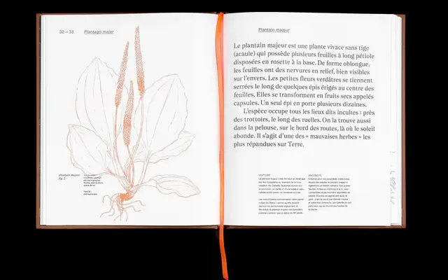
A high-contrast serif drawing on Clearface and Arts and Crafts sensibilities, distinguished by teardrop-shaped terminals in the lowercase.
About
Available in five weights from Light to Bold, each with a matching italic, the family also ships as two variable fonts covering the full Light-to-Bold axis for both upright and italic. Teardrop terminals in the lowercase and strong stroke contrast give the design a refined, rhythmic quality suited to editorial and typographic applications. Language support spans Latin Extended-A, covering a broad range of European languages.
Classification
Nantes draws from Clearface, a late 19th-century typeface with strong stroke contrast and refined curves, placing it within the transitional serif tradition with display-leaning characteristics. The teardrop terminals and high contrast align it with expressive editorial serifs rather than purely utilitarian text faces.