Spezia Serif
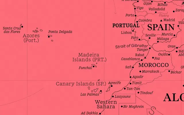
A transitional serif in 144 styles, spanning four optical sizes and three widths, designed to pair with its sans counterpart in a unified typographic system.
About
Built on 18th-century transitional models, Spezia Serif is structured around four versions tuned for specific reading conditions: Version A is high-contrast for display work, while Version D opens up with a near-monolinear stroke for small text. Six weights from Book to Black, each with italics, run across Normal, Narrow and Condensed widths, and the full family is available as a variable font. It completes a typographic system alongside the Spezia sans, offering designers a coherent tool for complex, multi-scale layouts.
Classification
Inspired explicitly by 18th-century transitional typefaces, Spezia Serif combines the contrast and period detail associated with the transitional model with a modernised, clean expression suited to contemporary use across multiple optical sizes.