MD Primer
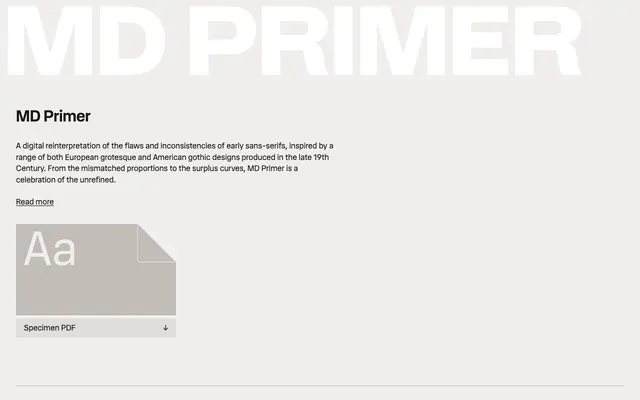
A sans-serif that deliberately reconstructs the mismatched proportions and surplus curves of late 19th-century European grotesque and American gothic type, treating their inconsistencies as features rather than faults.
About
Drawing on a documented range of historical specimens from foundries including Bauer'sche Gießerei, Schelter & Giesecke and Marder, Luse & Co., MD Primer treats the irregularities of pre-standardisation sans-serif type as its defining characteristic. Six weights from Light to Black each come with matching italics, giving the family a working range beyond its display origins. The extended Latin character set covers a broad sweep of languages, making it more practical than its historical premise might suggest.
Classification
MD Primer draws directly from late 19th-century European grotesque and American gothic type specimens, intentionally reproducing their mismatched proportions and idiosyncratic curves rather than rationalising them into a modern grotesque.