Shift
MCKL · Jeremy Mickel · 2012
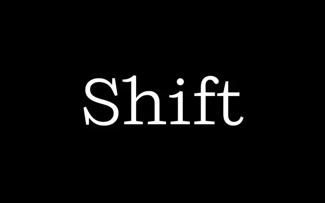
A slab-serif by Jeremy Mickel drawing on late 19th-century American Egyptian types, shifting character from typewriter-like lightness to dense titling weight across six grades.
About
Designed by Jeremy Mickel and published in 2012, Shift takes its cue from Franklin Circular by A.D. Farmer & Sons. In lighter weights the flared terminals and prominent serifs recall a typewriter face; in heavier settings the tight spacing and compressed counters push it firmly into titling Egyptian territory. The family runs to 12 styles across six weights with matching italics, and took a Certificate of Excellence in Typeface Design at TDC².
Classification
Inspired by American slab-serifs of the late 19th century, particularly Franklin Circular; the heavier weights function as titling Egyptians while lighter weights take on a typewriter-like quality with flared terminals.