Superior Title
MCKL · Jeremy Mickel · 2013
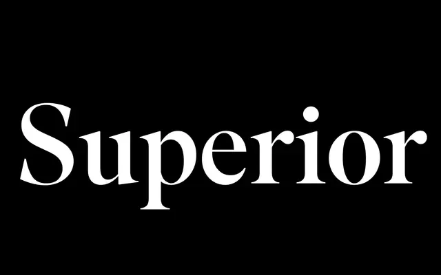
A high-contrast transitional serif by Jeremy Mickel, occupying the territory between Bodoni and Times through the lens of naive American titling types.
About
Designed by Jeremy Mickel and published in 2013, the family draws on early 20th-century American titling faces including Modern Title from Barnhart Brothers & Spindler, as well as phototype fonts from the 1970s. Ten styles span five weights from Light to Black, each with a roman and italic. Features include small caps, swash italic capitals, alternate glyphs and a full suite of ligatures, making it well suited to editorial and display work that wants historical warmth with sharp vertical contrast.
Classification
Described by the foundry as a high-contrast transitional typeface sitting between Bodoni and Times, with roots in naive American titling faces and phototype fonts of the 1970s.