Nordvest
Monokrom · Nina Stössinger · 2016
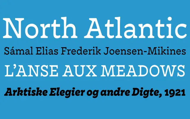
A serif family by Nina Stössinger that inverts conventional stroke contrast, stressing the horizontal rather than the vertical axis across four weights and eight styles.
About
Designed by Nina Stössinger and released through Monokrom in 2016, Nordvest reverses the traditional thick-thin order by emphasising horizontal stroke direction, producing a texture that feels quietly unconventional in running text. Heavier weights carry a friendly, open quality while lighter styles settle into dependable workhorse territory for longer-form setting. The family was recognised by Typographica, TDC, CommArts, FontShop and Print Magazine on its release.
Classification
Nordvest reverses conventional thick-thin stroke contrast by emphasising horizontal direction over vertical, placing it in a distinctive humanist serif tradition that subverts classical models.