Numera
Monokrom · Frode Helland · 2021
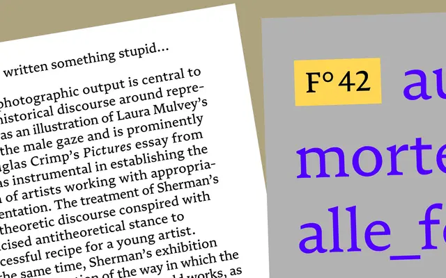
A book typeface ten years in the making by Frode Helland, balancing familiarity with an original visual language rooted in texture and curve continuity.
About
Designed by Frode Helland over a decade with design assistance from Inga Plönnigs, Numera draws on the tradition of literary typesetting without reproducing any single historical model. Its forms are driven by texture and the continuity of curves rather than period convention, producing a rhythm that sits comfortably in refined body text while retaining something genuinely individual. Five weights from Blond to Black, each with a matching italic, give the family practical range for book and editorial work.
Classification
Numera is described as a Brotschrift designed for book typography, grounded in literary typesetting tradition. Its texture-driven visual language and balance between static and dynamic tension place it in the transitional serif category, with humanist inflections.