Telefon
Monokrom · Sindre Bremnes · 2012
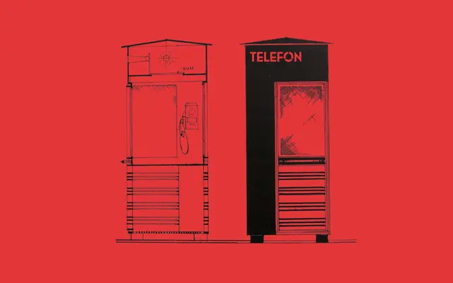
A geometric monolinear sans by Sindre Bremnes, drawing on architectural lettering and signage traditions, expanded from three weights to twelve styles in 2017.
About
Originally released in 2012 with three weights, Telefon was substantially updated in 2017 to twelve styles spanning six weights from Light to Black, each with a matching italic. The even, monolinear stroke and geometric construction give it a clean neutrality that has suited everything from Norwegian county identity programmes to editorial design and commercial branding. Its award recognition from FontShop, Visuelt and Typographica at the time of release reflects the quality of its original conception, not just its expansion.
Classification
Explicitly described as a geometric monolinear sans serif, with even stroke weights and geometric construction throughout its forms.