Precise Sans
Mota Italic · Rob Keller · 2022
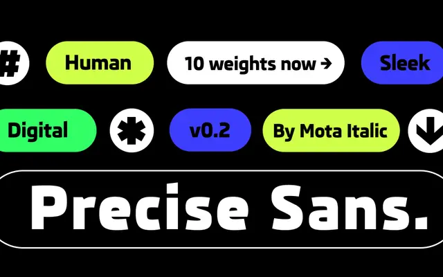
A screen-optimised geometric sans by Rob Keller, originating from a custom commission for a major European automaker and redrawn into a broader ten-weight retail family.
About
Designed initially for the digital displays of a European car manufacturer, Precise Sans has been fully redrawn without the constraints of proprietary automotive software. The result retains the clean, technical character of its origins while adding warmth through refined details that resist the coldness of purely geometric designs. Currently in beta with ten upright weights and two italics, the planned release will extend to thirty styles including back-slanted italics, plus a variable version, with Greek, Cyrillic and Hebrew scripts to follow.
Classification
Squarish, screen-optimised letterforms with a techie, clean aesthetic place this firmly in the geometric sans tradition, though deliberately softened with humanist details to avoid pure mechanical coldness.