Sans Precise
Mota Italic · Rob Keller · 2022
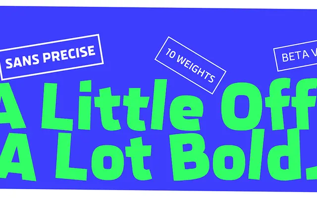
A deliberately irregular geometric sans by Rob Keller, built on squarish pixel-derived forms and animated by randomised character alternates that prevent any two lines of text looking alike.
About
Originally drawn as a custom typeface for digital displays in the automotive sector, Sans Precise has been entirely redrawn without those technical constraints, trading precision for controlled disorder. Four variants of every character are selected automatically at random, producing text that reads as genuinely irregular rather than artificially distressed. Ten upright weights are currently available, with twenty italic styles planned alongside a variable font that will span from chaotic to clean in tandem with its companion typeface, Precise Sans.
Classification
A squarish, pixel-influenced geometric sans with deliberately irregular, humanised details; sits within the geometric sans tradition but departs sharply from clean modernist conventions through randomised alternates and distorted outlines.