Show Me the Mono
Mota Italic · Rob Keller · 2021
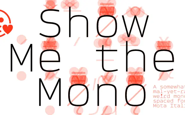
A six-weight monospaced family with oversized punctuation dots, dual-style punctuation weights and an unusually large set of extras including arrows, enclosed letters and emojis.
About
Designed by Rob Keller and published in 2021, it leans into monospacing as an aesthetic choice rather than a technical constraint, using oversized dots on i, j and punctuation to create a speckled texture across text. Punctuation and symbols come in two forms: a thin version that stays constant across all weights for a distinctive look, and a weight-matched version for a more conventional feel. The family ships with over 300 extras per weight, including 76 arrows with extendable tails, enclosed letters for 400-plus languages, and emoji-style dingbats.
Classification
A monospaced typeface with a strict fixed-width grid across all glyphs, designed with simple open letterforms and quirky oversized dots. No kerning by design, consistent with monospaced convention.