Vesper
Mota Italic · Rob Keller · 2008
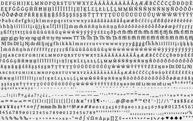
A text serif by Rob Keller with calligraphic roots in Devanagari, built for sustained reading across five weights with extensive OpenType feature support.
About
Designed in 2008 and substantially revised in 2016, Vesper draws its angled serifs and ball terminal treatments directly from Devanagari calligraphic strokes, giving the Latin characters an unusually organic quality. The family runs from Light to Heavy, each with italics, and includes contextual alternates that subtly adjust serifs and spacing to produce an even typographic grey on the page. Small caps, petite caps, nine numeral sets, case-aware punctuation and contextual quote handling make it well suited to complex book or magazine typesetting.
Classification
Vesper features pronounced thick-thin stroke contrast, angled serifs with calligraphic origins, and ball terminals, placing it firmly in the transitional serif tradition with a contemporary refinement.