Mostly Serif
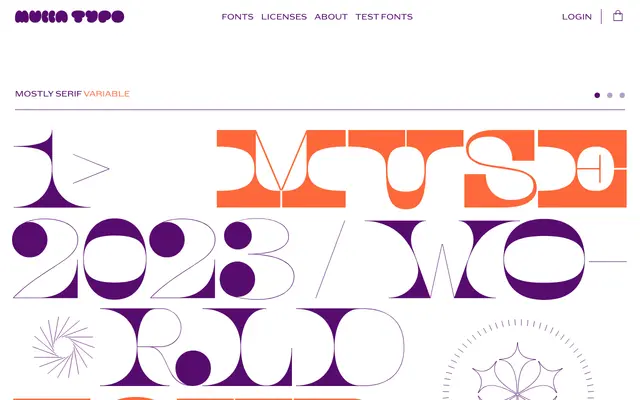
An experimental serif family born from an AIGA/NY anniversary poster commission, designed to sit on the edge of legibility by subverting conventional letterform recognition.
About
Originally conceived as a poster typeface for AIGA/NY's thirtieth anniversary, Mostly Serif plays with the question of what constitutes a letter, using serif construction to blur distinctions between characters and create deliberate ambiguity. Unusually, the Black weight is more legible than the Light, as heavier serifs and increased stroke thickness consolidate the forms rather than disperse them. The family is available in five static weights and as a variable font, supported across an extensive range of Latin-based languages.
Classification
Mostly Serif sits at the border of legibility, with serif construction deliberately pushed to the edge of delirium; it is a display typeface first, with serif letterforms that challenge conventional letter recognition rather than aid reading.