Sans Flux
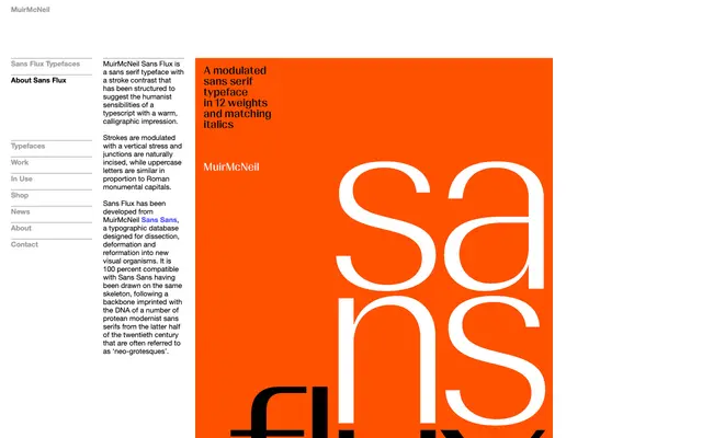
A stroke-contrasted sans serif from MuirMcNeil that layers humanist warmth over a neo-grotesque skeleton derived from the Sans Sans typographic database.
About
Drawn on the same skeleton as MuirMcNeil Sans Sans, Sans Flux introduces vertical stroke modulation and naturally incised junctions to give a calligraphic quality uncommon in neo-grotesque forms. Uppercase proportions echo Roman monumental capitals, lending the typeface a classical bearing alongside its modernist structure. The result sits between the discipline of a grotesque and the warmth of a humanist sans, suited to editorial and identity work that wants both qualities.
Classification
Described as a sans serif with vertical stroke contrast and calligraphic impression, drawing on neo-grotesque DNA but shaped by humanist sensibilities akin to typescript forms, placing it squarely in humanist sans territory.