Sans Sans
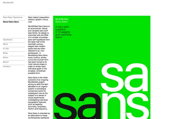
A deliberately restrained neo-grotesque in 13 weights, drawn to strip each glyph to its most natural and economical form.
About
Sans Sans takes its cues from the neo-grotesque tradition of the latter twentieth century, paring every contour and counter form back to its simplest possible state. The family runs to 13 matching weights in upright and italic, offered as a deliberate counterpoint to sprawling multi-subfamily type systems. It is conceived as part of a longer MuirMcNeil research project investigating legibility, rhythm and typographic structure through a reduced, archetypal Latin alphabet.
Classification
MuirMcNeil explicitly cite neo-grotesque lineage, describing Sans Sans as drawing on 'elegant late modern styles often referred to as neo-grotesques', with each glyph reduced to its simplest organic form.